-
-
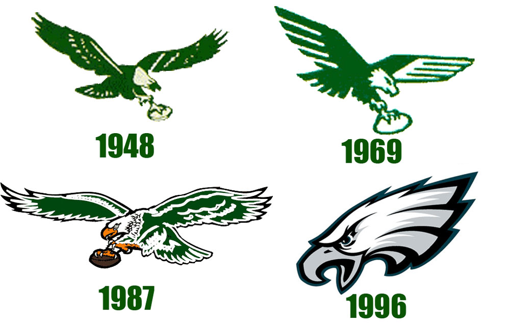
I actually think the one from 48 looked more modern than the one from 69 -
Chronologically starting '48
Gay, gay, gay, OK"I could buy you." - The Village IdiotComment
-
One is smarter than everyone else.Comment
-
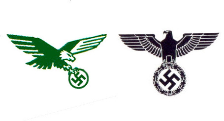
People thought the '69 one looked like the Nazi symbol
I think that's why they got rid of it.
Comment
-
It has an art deco look.Comment
-
It really did
Who designed that one, Schicklegruber?Originally posted by Two Gap Penetrator View Post"I could buy you." - The Village IdiotComment
-
-
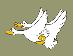
Figures you'd like the Foghorn Leghorn version.Comment
-
The other ones are ridiculously out of proportion
Ever see a bald eagle with a head the size of a regulation football? Ludicrous"I could buy you." - The Village IdiotComment
-
Here's the Freddie Mitchell version,
Comment
-
They considered something like this, but it was too close to the truth.
Comment
-
They seem to change about every 20 years, so it's getting near time for a change.--------
"We choose to go to the moon."Comment
-
I'm A Traditionalist -- But...
The '48 logo is the one I grew up with and still prefer. However, I have to admit as updated versions go, the 1987 version is damn good, too.
1969 and most of all, the current version -- drop them in the depths of the ocean never to be seen again.
Given a vote I'd take 1987 first with 1948 close behind."If I owned Texas and Hell, I'd rent out Texas and live in Hell!"Comment
-
'87
Logo AND uniform.The truth is incontrovertible. Malice may attack it, ignorance may deride it, but in the end, there it is - Winston ChurchillComment

Comment